Redesigning the Moja Network UI
BRCK wanted to create a points driven ecosystem for their Moja Public WiFi Network.

Overview
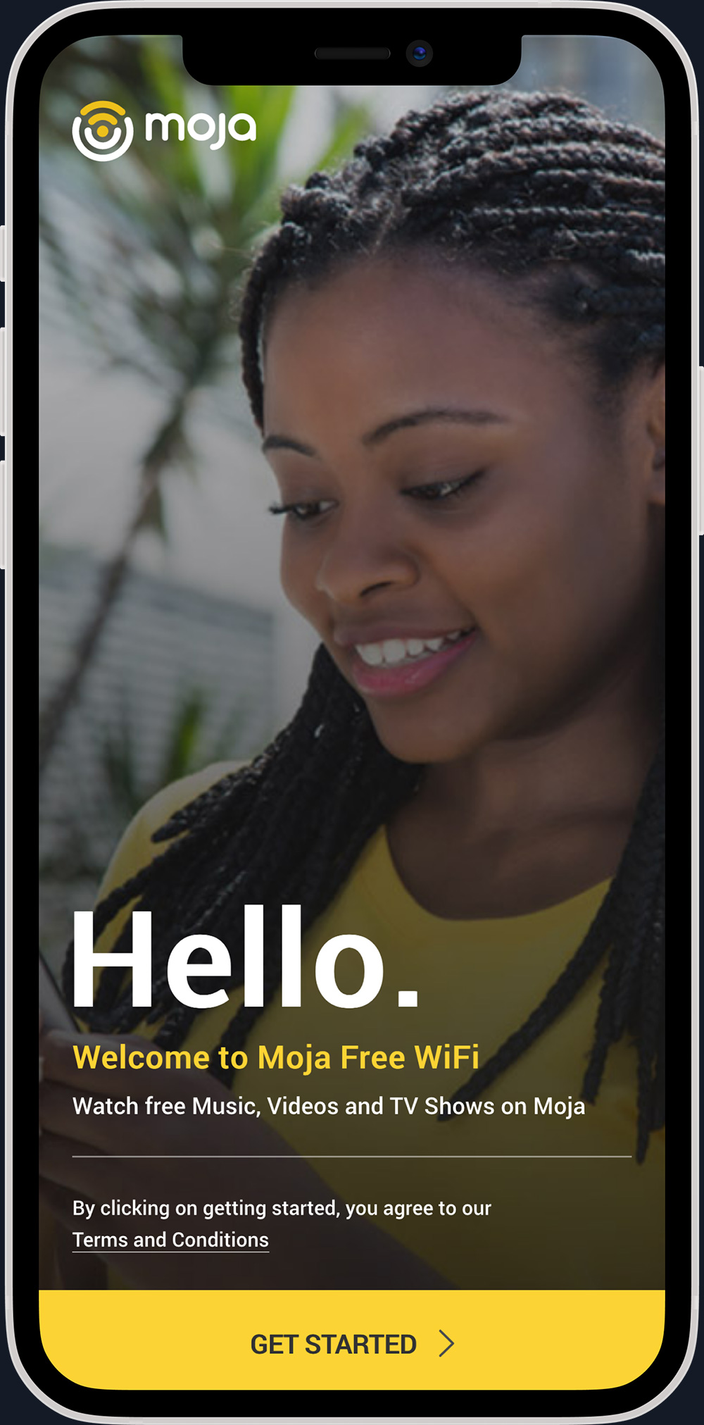
Moja is BRCK’s free public WiFi network, deployed in matatus (public transport) and selected fixed locations across Kenya. It allows users to connect to the internet and access offline content such as movies, music, and books.
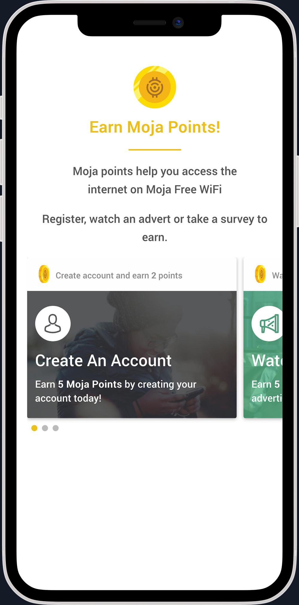
BRCK wanted to introduce Moja Points. This new value system allowed users to earn internet access through engagement and activity instead of money. To support this shift, the Moja interface needed a complete redesign.
The project required balancing the needs of a large, diverse user base with the business goal of increasing revenue through digital engagements.
Product Challenge
Introducing Moja Points required a fresh approach to the user experience. The redesign needed to achieve the following:
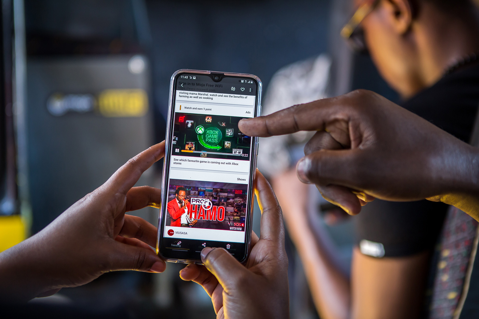
- A mobile first experience since 99 percent of users accessed Moja on their phones.
- A seamless onboarding process that explained Moja Points clearly and helped users start earning immediately.
- Multiple earning paths since most users depended on points to browse online.
- A clean and engaging way to present Moja’s stored content and drive higher content consumption.
The platform also needed to accommodate new business features and future revenue opportunities.
My Role
I initially joined the project to develop responsive HTML and CSS templates based on the design team’s mockups. As the initiative expanded, I transitioned into a broader product design and leadership role. This included:
- Wireframing and prototyping new experiences
- Designing the full UI for Moja’s business features
- Leading the product effort within BRCK’s Business department
- Collaborating with engineering to deliver production ready specifications
The Redesign
After multiple iterations, we redesigned onboarding to explain Moja Points clearly and to help users earn points quickly.
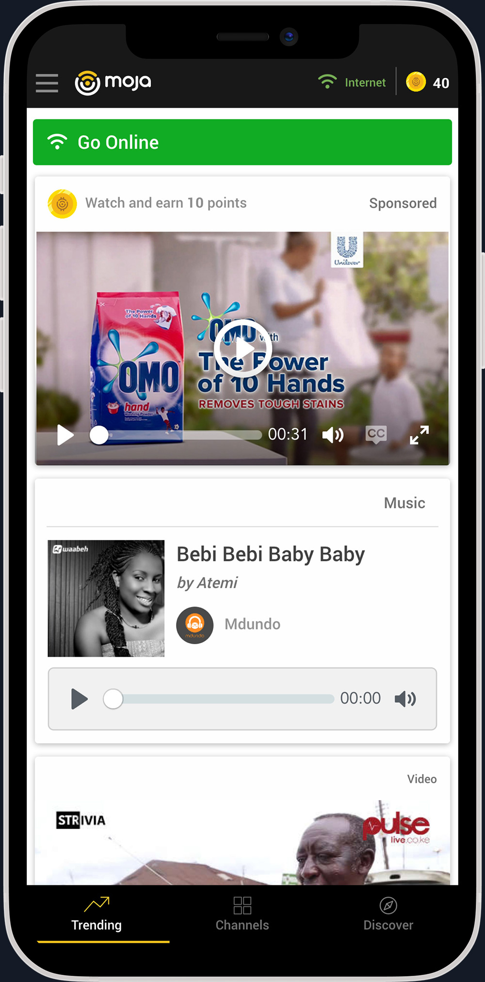
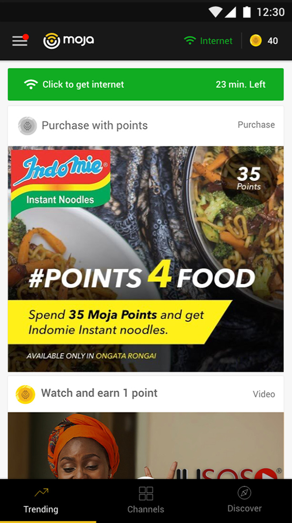
Once onboarded, users could view their point balance, spend points to go online, and earn more points by interacting with partner content.
We also introduced flexible card layouts for different content types. This created a clean and enjoyable browsing experience that made content discovery easy.
Expanding Moja Into a Revenue Platform
As weekly user numbers grew, BRCK created the Moja Business team to unlock new revenue opportunities.
In my role as product lead and designer of the Moja business team, I focused on designing features that served both large corporate clients and everyday Moja users.
Moja Soko for Small Business Listings
User research revealed that many small and informal businesses struggled to gain visibility on platforms such as Google, Instagram, and Facebook.
To address this gap, we created Moja Soko. The first feature allowed users to add a business listing for free. Later, these businesses would be able to promote their products on Moja for an affordable fee.
Design Iterations
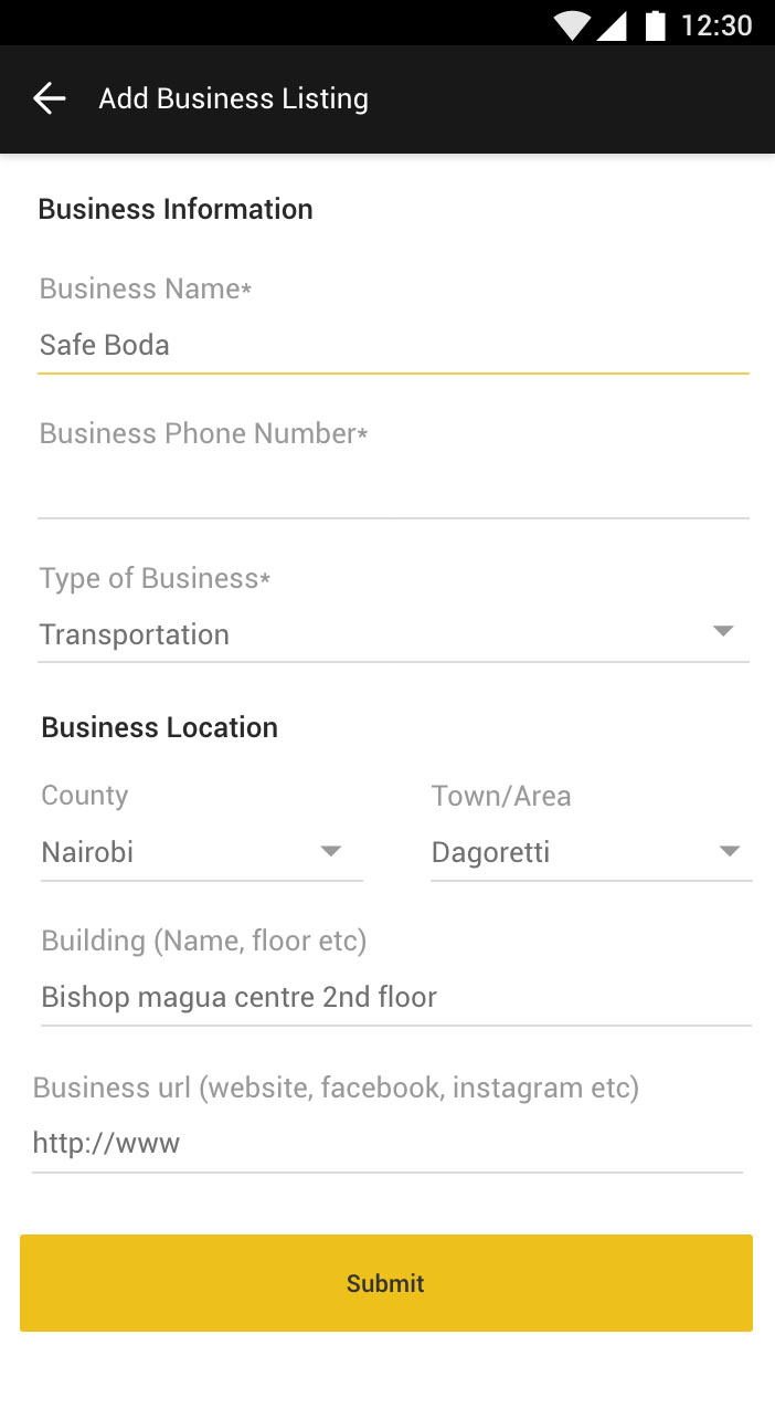
First Iteration: All fields appeared on a single page
This approach caused challenges. Some users felt uncertain about why certain fields were needed. The form also felt intimidating to users who were not very tech savvy. Adding more fields in the future would have been difficult.
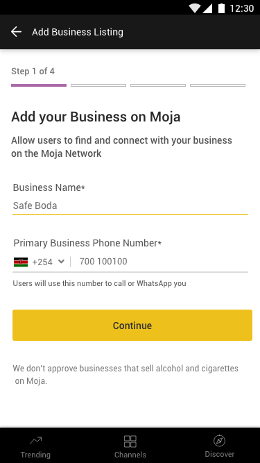
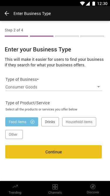
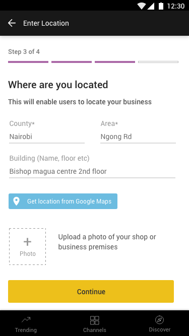
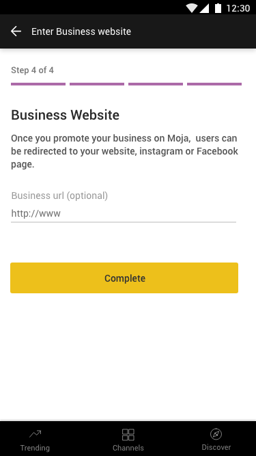
Version 2: A clear multi step flow.
I decided to separate it into multiple steps. Each step explained why the information was required. This made the process more comfortable for users and gave the team flexibility to reorder fields or add new ones during iteration.
The feedback was great and a key insight emerged. More steps can be easier than fewer steps when each step is simple and clearly explained.
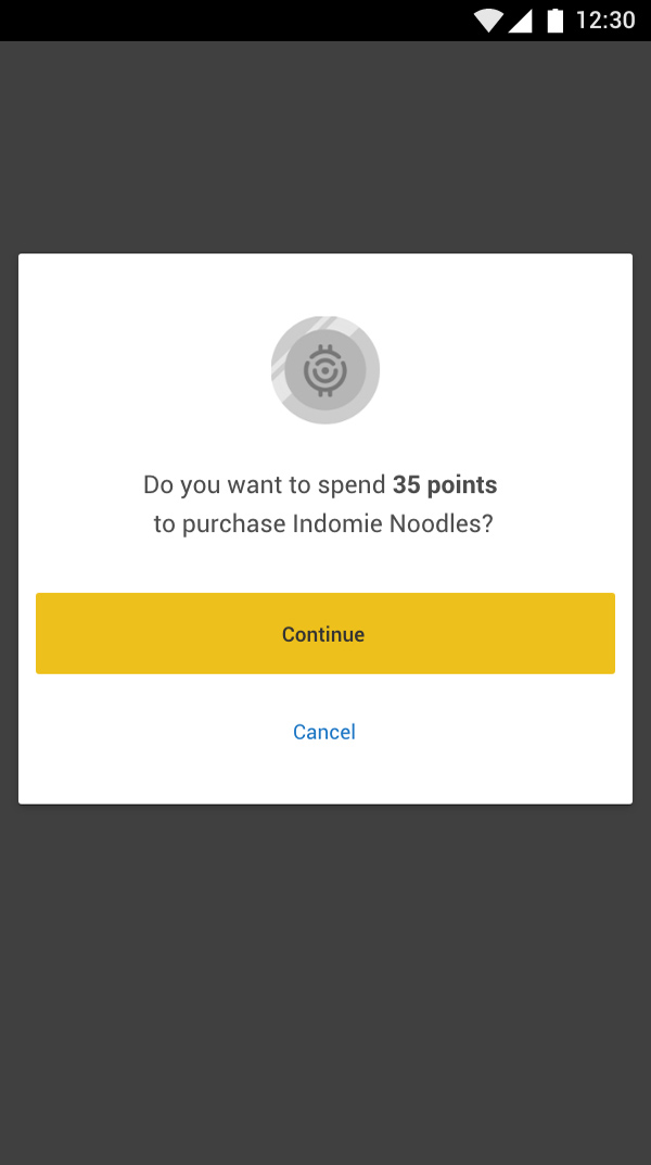
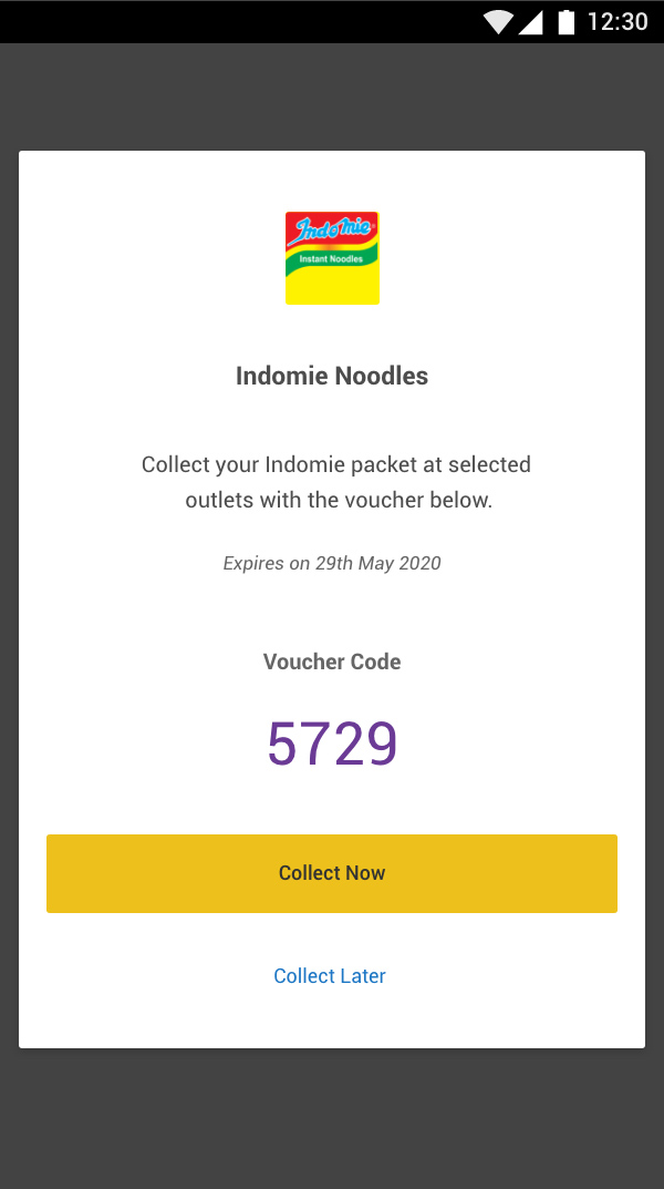
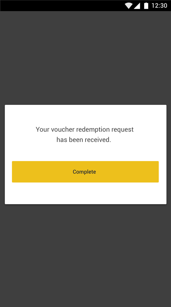
Points for Food During Covid-19
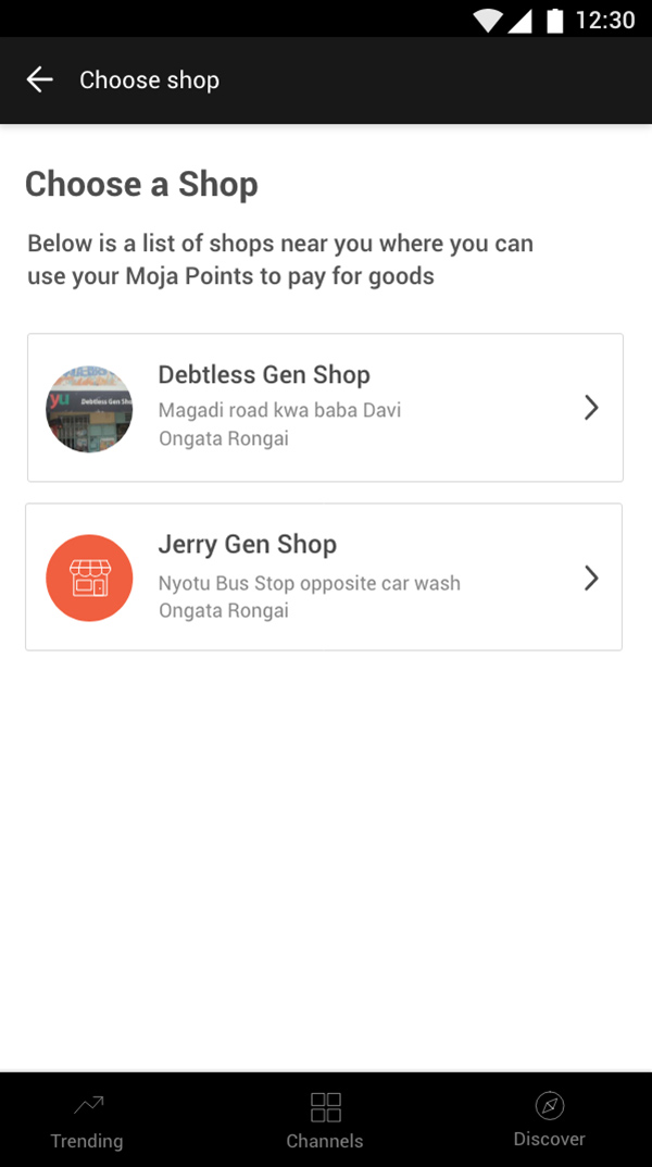
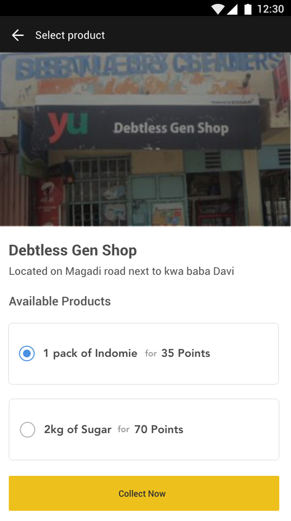
When Covid 19 began, many Moja users, especially those living on less than two dollars a day, struggled to buy food. BRCK teams worked together to quickly test a feature that allowed users to redeem Moja Points for essential items.
I designed the UX for the pilot under a very tight timeline. The feature needed to:
- Help users browse participating shops in their area including a name and photo
- Show which items were in stock
- Generate a voucher code that could be used immediately or later
Outcomes
- The redesign increased engagement and contributed to a significant rise in weekly active users
- Content consumption improved because of clearer navigation and stronger visual presentation
- Early tests from business listings and Points for Food showed strong interest before being paused due to lockdown, when users could no longer access Moja WiFi
Key Learnings
- The redesign increased engagement and contributed to a significant rise in weekly active users
- Clarity reduces friction. Simple and well explained steps outperform dense forms
- Thoughtful design can open new business models. Moja Points and Moja Soko created new paths for revenue while staying aligned with user needs